
|
|
Boost : |
From: Christoph Ludwig (cludwig_at_[hidden])
Date: 2004-12-15 03:38:31
On Tue, Dec 14, 2004 at 09:10:23AM -0600, Rene Rivera wrote:
[...]
> It's not meant to indicate it's a button. It's meant to look like a logo
> label. The button functionality is actually superfluous as you can just
> press return to do the search. But submit input item is required fr the
> form, and text browsers, and 508 accessibility. So I don't think it's
> important or desirable having it announce itself as a button.
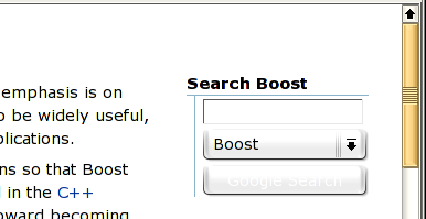
But it shouldn't give the impression of an "empty" button either...
I am not sure whether it is due to some recent changes or whether I simply
missed it before, but on Konqueror 3.3.2 the button appears with a white font
on a light grey background. It's very hard to decipher unless you know what is
supposed to be written there.
I am going to attach a screenshot that shows the problem.
Regards
Christoph
--
http://www.informatik.tu-darmstadt.de/TI/Mitarbeiter/cludwig.html
LiDIA: http://www.informatik.tu-darmstadt.de/TI/LiDIA/Welcome.html
Boost list run by bdawes at acm.org, gregod at cs.rpi.edu, cpdaniel at pacbell.net, john at johnmaddock.co.uk