 |
Boost : |
From: David Abrahams (dave_at_[hidden])
Date: 2004-11-24 12:13:21
Reece Dunn <msclrhd_at_[hidden]> writes:
> Hi All,
>
> I have made a few modifications to my Wiki-inspired front page design.
> It is available here:
>
> http://uk.geocities.com/msclrhd/boost/boost2.html
Even after closing the annoying Yahoo ad, I don't like it as much as
Rene's latest effort (but then, he's had more criticism to work with
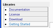
than you have ;->). The left column in particular looks odd (see
enclosed).
The white column where the bullets are and the double line at the
bottom of each box is most of it, but I find the boxes around each
button a bit harsh and unneccessary. You already have bullets; you
don't lines separating things.
--
Dave Abrahams
Boost Consulting
http://www.boost-consulting.com

Boost list run by bdawes at acm.org, gregod at cs.rpi.edu, cpdaniel at pacbell.net, john at johnmaddock.co.uk