
|
|
Boost : |
Subject: Re: [boost] [all][testing] Regression summary upgrades
From: Tom Kent (lists_at_[hidden])
Date: 2015-05-14 11:45:34
On Thu, May 14, 2015 at 8:54 AM, Adam Wulkiewicz <adam.wulkiewicz_at_[hidden]>
wrote:
> Tom Kent wrote:
>
>> On Wed, May 13, 2015 at 8:42 PM, Adam Wulkiewicz <
>> adam.wulkiewicz_at_[hidden]>
>> wrote:
>>
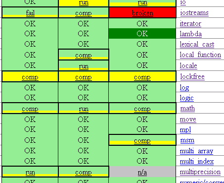
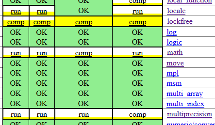
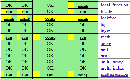
>> So once again, the summary showing graphical percentage of the failing
>>> tests per library/toolset could look like this:
>>>
>>>
>>> https://raw.githubusercontent.com/awulkiew/data-images/master/summary-percent-graphical.png
>>>
>>>
>>> I like it, one suggestion:
>> white background instead of green for the ones with some issue?
>>
>
> I'm glad that you like the overall idea.
> Your suggestion could look like this:
>
> https://raw.githubusercontent.com/awulkiew/data-images/master/summary-percent-graphical-w.png
>
> https://raw.githubusercontent.com/awulkiew/data-images/master/summary-percent-graphical-w-b.png
>
> I considered it too but though that since the purpose of this change is to
> increase the overall greenness of the matrix according to some measure, in
> this case the percent of passed tests, then probably the green color should
> be kept.
>
Yeah, after seeing that, I do think the green is better than the white,
ignore my suggestion.
>
> Btw, this is how it could look like if the bar was horizontal:
>
> https://raw.githubusercontent.com/awulkiew/data-images/master/summary-percent-graphical-h.png
>
>
Ooo, nice. I like horizontal much better.
Tom
Boost list run by bdawes at acm.org, gregod at cs.rpi.edu, cpdaniel at pacbell.net, john at johnmaddock.co.uk